The Project
The BeatsFest logo design project was an assignment for my coursework at Southern New Hampshire University. It involved designing a logo and style guide for a fictitious music streaming service called “BeatsFest”. The target audience was primarily Gen Z, with an emphasis on social awareness, simplicity, and bright colors.
Design Process
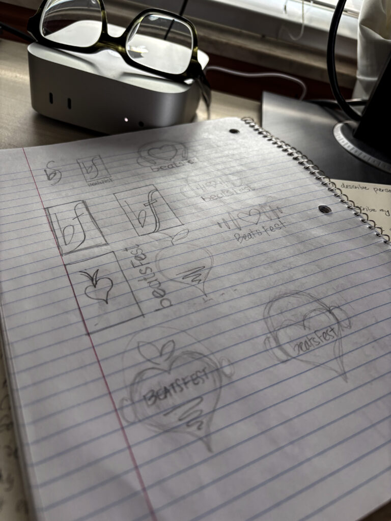
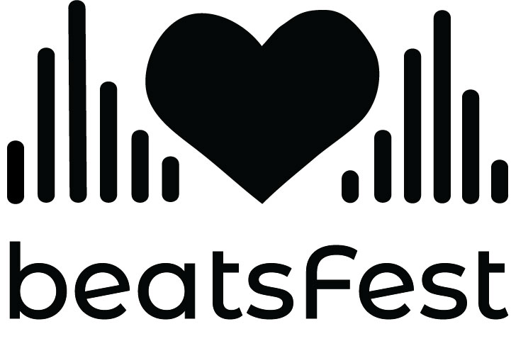
The design process for this logo involved several sketches and digital renderings. I knew I was onto something when I associated the word “beat” with the word “beet”. Once this concept was in place, I then continued to revise the shape of the logomark, added and adjusted the colors, and created the style guide for the brand.
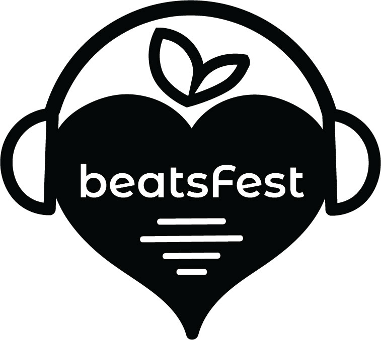
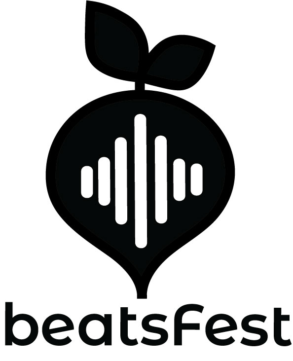
“The beet is a powerful vegetable. Just like our listeners, it is both sweet and a little dirty. It is humble and quiet on the outside, but intense on the inside. It’s the punk rock of vegetables.”
-BeatsFest Style Guide
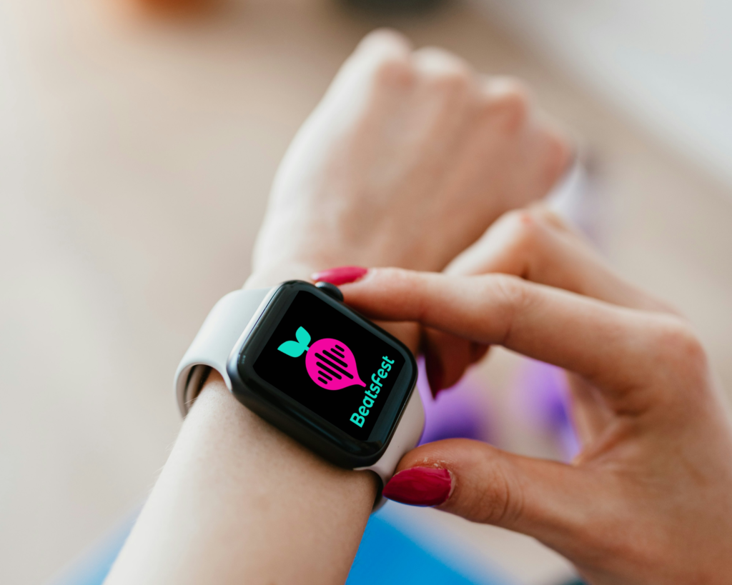
BeatsFest Style Guide
This is a complete style guide for the BeatsFest brand, including brand statements, logo design and guidelines, typefaces, and images. All content was written and assembled by me.